Tuesday, 31 March 2015

Audience feedback and changes


After completing the outside of covers of my digipak, I wanted to receive some feedback from my target audience (16-24 year olds) to ensure that they were pleased with the overall image, as it is crucial that our target audience like the products. I am glad that I decided to do this because overall the feedback that I received was very positive. Overall our target audience were very happy with the front cover of the digipak and they liked the simplicity of the artist being solely represented on the cover. One of the main things that our target audience liked about the outside covers is the close up image of the artist and the style of font that we decided to use as it is very easy to read. However we was given some constructive criticism to ensure that our cover looked as professional as it could and that it followed the typical conventions of an album.


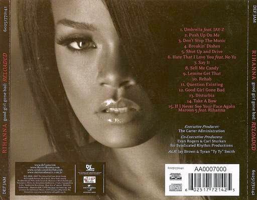
One of the pieces of feedback that I received was that I needed to add more tracks to my album. It is very unlikely that an artists completed album would only feature 6 songs. As a result of this I carried out some research and found that on average an album features between 10-18 songs. As a result this I added 4 tracks to my album. I am pleased that I made this change to the back of my album cover, because as you can see from the two images above, the second image is more representative of a real life cover. I decided to only have 10 songs on the album because of the backing that I decided to use on my font and I felt that if I added more songs to the album it may have begun to look quite cluttered, which is not our desired effect.

Furthermore, another change that I had to make was to the titles on the front cover. One of my target audience members pointed out that it is conventional for the artists name to be larger than the title of the album. Therefore I swapped round the order of the artists name and the album title to ensure that my work was following the typical conventions. I am pleased that I made this change as we want our album to be as representative of a professional standard as possible.

Overall I am very pleased with the completed front and back covers of my digipak. I think that it is effective that I have not tried to over complicate the overall image and have kept it very simple with only using one image of the artist on the front cover and using the same front throughout. Moreover, I think that the dark image I have created using different filters ties in very well with the music video that we have created and therefore as a whole the artists products have began to come together as the colours are reflective of the dark narrative of the music video.

Monday, 30 March 2015

Creating the back cover of our digipak


After carrying out some research into professional digipaks and what the typically include on the backing of the cover, I decided that I had gathered enough information to start making my own. One of the first decisions that I made was to not include an image of my artist on the back and instead include a plain background with a pattern. This is because, after carrying out some research I found that back covers tend to not have an image so that the list of tracks can be clearly displayed. As a result of this, I took a plain black background and edited it to create the image that is featured above. Overall I pleased with the visual effect that has been created and it ties in with the overall effect of the album and adds to the distressed image. 

After creating the basic background to our cover, we then began to add the crucial information that is needed, which is displayed in the below image.


Firstly, I wanted the backing of the album to be representative of the front and therefore I carried over the same font and the backing behind it. Originally I wanted to use a range of fonts on the album. However as I began to piece all of it together, I realised that less is more and it looked more professional when didn't try and overcomplicate the image. 

As well as adding the list of tracks featured on the album I also had to add the important information that is needed on the back of a CD such as the barcode, the record label producing the CD and the copyright information. This is all displayed in the image above. 

We decided that our CD should be produced by a niche record label, this is because the artist is only starting out in the music industry and therefore does not have a lot of financial backing. Therefore we chose to use Domino Record label.

Overall I am pleased with the backing of the digipak and I like the simplicity of it. I think that it is effective that we have not tried to over complicate the cover, however it is still interesting enough to grab our target audiences attention. In order to ensure our cover is as successful as possible I will represent the product to them and make any final changes.


Research into the backing of digipaks

Before creating the backing to our digipak I thought that it was important to research into professional digipaks and what information is often displayed on the back cover. One of the things that I noticed whilst researching into the backing of digipaks is that they often do not contain an image of the artist/band, they are often quite plain. This is so that the tracks on the album can be clearly displayed. This was an important aspect to research into, as originally I was going to put an image of the artist on the back cover. However after looking at these covers I changed my mind. 

Another important aspect of the backing of the digipak is that it contains all of the crucial information needed. For example the production company, copyrights and the bar code. I made sure that before creating my own digipak I looked into the information that is required on the back to ensure that it was correct and so that my work could look as professional as possible. 


One of the things that I like about both of the digipaks that are featured above is that even though they do not contain an image. They do have a subtle pattern featured in the background. I think that this is an important element and is something that I will consider when creating my own digipak. If the background was simply a plain block cover I think that it might look quite dull and unappealing. 


I thought that because I am recreating a video to a song created by Rihanna it was important to look at some of her own work. Although the backing of her album features an image of herself and this is not something I am considering doing. I do like the overall effect of the album and that the image looks quite worn down. 

Another important aspect of all three of these album covers is the overall layout. Even though Rihanna's album contains the list of tracks on the right hand side, everything else from all the albums follows a similar structure. It is important that when I create my own backing, I consider this professional layout and contain all the important information at the bottom of the cover. 

Creating the backing for our title

As I began to try adding different fonts to the front of our digipak, I decided that I wanted a background on the font. This is because our front cover contains a close up image of the artist and I thought that if we didn't add anything to the cover, it could potentially end up looking quite bland. 

As a result of this I started researching into images on google. I wanted to find a background pattern that looked quite distressed to fit in with the overall tone of our video and the artists image. I thought that it would a good idea to find an image of splattered black and white ink. After some research I found the image that is featured below. 


Although the image itself was not in the shape that I wanted it to be. Therefore I uploaded the image to photoshop and started to edit the image and change the shape of it so that I could add the text over the top.


I decided to cut the image into the shape that is shown above. I didn't want the image to be too precise so whilst cutting the image I made a rough outline. I was pleased with the shape that I created. However when I added it onto my cd cover it blended in too much with the artists jumper. Therefore I decided to lighten to the backing of the image and change the contrast so that the ink splatters were more prominent on the page.


In order to adjust the colouring of the image I had to change the input levels, this is displayed in the print screens above. I completed this technique using photoshop.


The image above shows backing featured on the front cover with the title of the album and the artist's name over the top. Overall I am very pleased with the visual effect that the backing has created. I think that it draws attention to the title of the album, without the backing it is likely that the text would fade into the background because of the dark colouring used throughout. 

Sunday, 29 March 2015

editing the front cover

I decided that the image for the front cover of our digipak should feature the artist. I thought that in order to make our cover appeal as professional as possible we should include a close up image of the artist on the cover and try to not over complicate the back ground location. It is often the case that most solo artists will feature an image of themselves on the cover of their product. 

I think that the location for this image is very effective. Although it features a fence in the background, it is quite distressed and therefore adds to the overall image that we are trying to create and therefore ties in with the music itself, which also features a range of isolated locations.

As well as this, we also made sure that the artists image tied in with the music video. Therefore the artist is wearing one of the outfits that is featured in the Disturbia video and is always wearing a bold lipstick which is a typical image featured throughout the music video.


After taking a variety of images we decided that the image above was best suited for the front cover of the digipak. This is because the artist is clearly displayed and therefore stands out. However after importing this image onto the computer I decided that it still looked quite bland and that it needed to be edited in order to appear more interesting. 


I decided to edit this image by sending it to my iPhone and using a photo editing app called After light. After receiving some audience feedback from my target audience I established that they preferred the image in black and white, as they thought that the image looked more interesting in particularly how the artist stands out from the contrasting back ground. As well as this the use of black and white enhances the artists facial features, for example her lips. 

At this point of the editing process I was very pleased with the overall effect that the image created. However I continued to edit the image by adding light strokes. I was personally pleased with the distressed image that these light strokes provided. Once again, I asked members of my target audience to ensure that it would also capture their attention, The feedback that I received was very positive and overall they preferred the image with the light strokes. 
Overall I am very pleased with the editing techniques that we have used and I think that we have managed to transform quite a bland image into something that looks quite professional. 

Rejected images for the digipak


I recently took some images to use on the front cover of my digipak. Our initial idea was to have an ordinary image of our artist in the front and a faded image of her screaming behind. I began to edit the above image to put in the background. One of the first things I done was remove the back ground as I was standing against a white door and this did not give the visual effect that we wanted, therefore I thought it would be best to completely remove the background. 

However as I began to put the images together, I very quickly realised that it was not creating the visual effect that I wanted,  As well as this I think the use of the white back ground for the cover of the CD cover is far too plain and boring. As well as this I think it decreases the professional aspect of the cover. 

As well as this, I also received some feedback from a member of my A2 media class who is not in my working group and they gave me some constructive feedback that the image was not visually interesting and looked very basic, in comparison to what could be achieved. 

As a result of this I realised that it was very important for me to take new images to use of the front cover of my digipak and therefore done this as soon as possible. 

I am pleased that I tested out this idea as it made me aware that it did not create the visual effect that I wanted and was not going to appeal to my target audience. I realised that a far less complex image is often required on the front of a CD cover in order for it to look as professional as possible.

Wednesday, 25 March 2015

Digipak

As we have started to look into creating our own digipak it is important that we have a basic template of what to follow. In order to do so I have looked at some images on Google in order to gather a greater understanding of what is expected. This is displayed below:


I think that it will be easier to create our digipak if we follow a guideline. Therefore I am going to use the images above as a template for our own coursework. I think that this simple research has been useful to us as a group as it has helped me to gather an idea in my head of what the expectations for a digipak are, this is important as it is different to a CD cover. 

As well as this it is important to look at some professional digi paks to see how other artists have styled their work.  An example of one of the professional artists that I have looked at is Taylor Swift, I decided to look at her because she appeals to a similar target audience. 


The image above displays the backing of Taylor Swift's digipak. This backing shows the list of songs featured on Taylor Swifts album and the information that is needed on the back cover. For example the record label that produced her album and the bar code. I think that this digipak is effective because it clearly displays an image of the artist on the backing and it is likely that this is exactly what her target audience want to see. As well as this, the font that displays the songs featured on the album is also very clear and easy for the audience to understand. 

It is important that when creating our digipak we consider all of the crucial information that needs to be displayed on the back cover. It is also important that we make sure we display the correct images throughout the cover, in order to make our product as appealing as we possibly can.

Fonts


I have began to gather some ideas of what I want our digipak to look like. It is important that as a group we spend time deciding on the style of our digipak as this will become a reflection of our artist and her work. 

The image above shows some of the fonts that I have been looking at and have considered using. One of the fonts that I particularly like is the last one. I like this font because it is simplistic and is easy to read, where as some of the other fonts are quite complex which could potentially make it difficult to advertise our artist, as some audience members may struggle to read the font. An example of this is the fourth font.  

I think that we should use more than one font throughout our digipak In order to make it appear interesting. For example we should a different font for the title of the album to the list of songs on the back cover. I think that we should do this because this is often reflected in professional artists work. Moreover if we was to use the same font throughout, it could become repetitive and therefore it would be not be eye catching on the shelf for our target audience to pick up. 

Overall I am pleased with some of the fonts that I have found, although I think that further research is needed in order to find the ideal font. for our digipak. As well as this, it is important that we gain audience feedback to ensure that our target audience are interested in purchasing the product.

Monday, 23 March 2015

Dancer

Whilst editing our music video we gained some feedback that our video was very orientated around our artist. Although we want our artist to be the main focus of the video, we also want a variety of shots so that our audience do not become disengaged. As well as this, quite often professional music videos tend to feature more than one person. As a result of this feedback we have decided to add a dancer into our video. I think that this is a great way of keeping the audience interested as it changes the atmosphere and tone of the song, which draws the audience into something different.


The print screens above display what our dancer looks like, his style and the location of the shots. Before filming our dancer we had to think of another location as we didn't want him to feature in a similar one to our artist as we wanted to keep the video exciting and tried not to be too repetitive.  Therefore we decided to use a brick wall. This location is very simple, however I think that it gives the desired effect. We didn't want the background of these shots to be too complex as it might draw away attention from the dancer himself.  Although, I think the wall is not too dull. 

Furthermore, I think that it is useful that the dancer is a male as this means we have both genders included in our video. This hopefully means we will be able to branch out to a larger target audience and interest both young males and females.  Males watching the music video could potentially be inspired by the young dancer and his talent.  As a result of this they may want to watch the video more than once or they could show their peers. 

Next, since we have begun editing this shots and placing them in the sequence where want them to feature. I am pleased with the overall look. As a result of this I am very glad that we listened to the constructive feedback that was given to us as it meant we was able to change the variety within in our music video and hopefully enhance its overall visual look.  I think that if we decided to ignore the feedback given to us and carried on with the artist throughout the whole video, it could've become boring and quite repetitive for our audience to watch. This means that they might not of even watched the whole video or are unlikely to want to watch it again. 

In order to improve our filming further I think it is important that we add a visual effect to the shots of the dancer. As well as this, we could adjust the lighting and contrast to make the dancer and the brick wall stand out, otherwise it could end up looking quite bland and that is not the effect that we want these shots to have. 


Monday, 16 March 2015

Locations

Whilst creating our music video we have tried to use a variety of locations in order to make the video appear as visually interesting as possible. As well as this, after researching into professional music videos it is often the case that the video features more than one location. Therefore as a group we wanted this convention to be represented in our work.


One of the first locations that we used whilst shooting our music video was a wooded area. We decided to use this area because the trees in the background create the cold image that we want our audience to feel when watching this music video. It is particularly helpful that we shot our music video during the winter months as the trees are bare, therefore they are symbolic of the artists feelings.


Another location that we used for our music video was a this isolated location that was located next to a castle. We decided to use this location because the brick is featured on all three walls. I think that this was a good location for some of our filming, this is because it is not a typical wall as it looks old and slightly abandoned. Therefore it fits in with the overall image that we are trying to create throughout the video. 


Next, we also decided to use the staging within our school which features a plain black wall, which I have mentioned in a previous blog post. I think that this location was ideal for the shots we wanted to create. This is because as you can see above, we wanted the focus to be on the artist and her movements, therefore we didnt want any distraction in the background. I am very pleased with the overall look of these shots, although the location isn't particularly interesting I think it creates a very interesting visual effect. 

Overall, I am very pleased with the locations that we have used for our music video. We have not tried to over complicate the video by using too many locations, I think that we have used the right amount in order to make it appear interesting and keep our audience watching. 


Editing

The print screens below display some of the progress that we have made during the editing process of our video.
 
 
Firstly, as you can see from the print screen above we have made some successful progress in the editing of our music video. We decided to use the green screen that is provided by our school in order to add a visual effect behind the artist. Since filming these shots, we have cut and matched up the lip syncing aspect of the video and placed them where we want them to feature in the video. However we are yet to decide on the image we want placed behind the artist. Furthermore, as we have not used the green screen before and this is a new technique that we will be learning as a group, it is important that we make the decision of what we want to feature behind sooner rather than later, as it could be a time consuming process.
 
Also from the print screen above you can see that we have added a ripple effect transition to our filming. This is because we are going from one location to another and therefore we wanted to display this as a new sequence through the use of a transition. We decided to use the one featured above as it fits perfectly with the narrative image we are trying to portray to our audience, which is that our artists head is not in the right mind-set after the event of a break up. I think that this ripple effect creates that mind-set.

 
The above print screen displays one of the different locations that we have used within our music video. Since filming these shots we have also began to edit them and place them where we would like to them be within the sequence. In order to improve this filming further I think that we should change the lighting and the contrast so that the brick wall is more prominent within the shot.

 
The next image displays one of the video filters that we have added to our shots. We decided to add this filter as the artist grips her hair. We think that by adding this filter to the shot it adds to the overall effect that we are tying to create within the video and the idea that the artist is losing her mind as she is no longer the same person.

 
Finally, the print screen above displays the track of filming and editing that we have completed. We are happy with where the shots have been placed and the lip syncing matches the song. I think that as a group we have made good process and I am happy with some of the final editing. However there are minor improvements that we need to make and we also need to film some extra footage to ensure that the video is not solely focused on the artist as this is not often the case in professional music videos.

Thursday, 5 March 2015

Blur filters


Recently we carried out some more filming for our music video. We found a very good location which happened to feature a plain black wall, we then used artificial lighting to make the artist stand out from the dark background. We wanted to have a plain background for this filming as we wanted the artists movements to be the focus of the shot. As our interpretation of the song is about how a breakup can consume your mind and body, we wanted the artist to appear possessed using different body movements. The print screen above displays the image that we are trying to portray to our audience. As well as this when it came to the editing process we added a blur filter on top of the filming using Final Cut. We decided to add this filter as it creates the image that the artist has left their own body as their mind is distorted. Overall, I am very pleased with the effect that the filter has added to the visual effect of the video. I think that it makes it appear more interesting to watch and will hopefully keep our audience engaged throughout. 


We also adjusted the lighting and the contrast on these shots after importing them into final cut. This is because the artist faded into the background slightly. However by brightening up the shot it made her stand out and therefore was an effective choice to make. 


Next, as you can see from the above print screen we have tried to use a variety of locations within our music video. This is because it is a convention of music videos to use more than one location. We used this location because of the destruction in the background, this could be a physical representation of how the artist is feeling. Whilst editing this filming we also decided to add a filter because as you can see it looks slightly distorted. I think this was an effective choice to make, however I do think that we should be careful not to add too many filters as it could become overbearing for the audience watching.

In conclusion I think that we are making successful progress with the editing of our music video. Although we have received some feedback on our video and have realised that it is very focused on the artist and that we should perhaps try to engage other characters in the storyline.